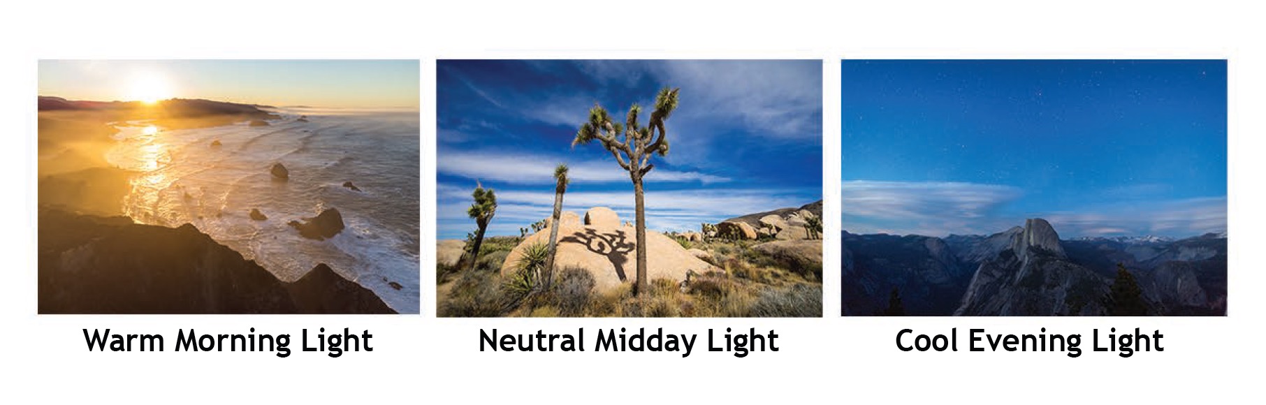
In this article, we’ll talk about how to use color temperature effectively in photography.
First, we’ll walk through the color temperature definition and some examples from a color temperature chart.
Then, we’ll look at different ways to use color temperature in our photography to create a desired mood or impact.
Hopefully, these tools and examples will give you the confidence to seek out that warm glow or balance the actual temperature of your scene.
As a professional photographer of primarily outdoor weddings and adventures, I’ve found that understanding color temperature is a great way to create more dynamic images.
I’ll talk about everything from learning to recognize the color of a natural light source, to using tools like gels in your flash photography, to implementing post-production techniques to create a cohesive image set.
What Is Color Temperature?
First, let’s define color temperature so we can start to understand how it plays a part in our photography.
Color temperature is a characteristic of light that describes the color appearance of the light.
When you hear a photographer talking about warm or cool light, they are referring to the color temperature.
Warm light is the golden light of a sunset, whereas blue light is cool, like that of a clear blue sky.
The Kelvin Scale
Color temperature is typically measured as degrees Kelvin (K.)
Warm colors such as red and oranges have a low color temperature below 3000K, while cooler colors like blues and whites have a high color temperature above 5000K.
This is a little confusing because we are saying that cool colors have a high temperature.
If you think of blue flames as hotter than orange or yellow flames it will help you remember that the cooler colors have a higher color temperature.
Daylight, for example, typically has a color temperature around 5500K.
Incandescent bulbs have a warmer temperature of around 2700K.
Check out our guide to understanding the Kelvin scale in lighting if you want to learn more about it.
How Does Color Temperature Affect an Image?
Color temperature impacts the mood and atmosphere of a space and it does the same to an image.
A warm color temperature can suggest a romantic or cozy vibe, while a cool color temperature can evoke calmness or cleanliness.
The color temperature of the light will impact how the colors appear in the image, with warm light enhancing reds and oranges and cool light making blues and greens appear more vibrant.
How Much Do You REALLY Know About Photography?! 🤔
Test your photography knowledge with this quick quiz!
See how much you really know about photography…
Additionally, the color temperature can impact the appearance of skin tones on your subject.
Color temperature variations can be also used to emphasize certain elements or create contrast in the scene.
Warm temperatures will contrast with cooler temperatures, so if you have both in one scene, it will appear with more depth.
Color Temperature and White Balance
Color temperature plays an important role in setting the correct white balance for an image.
Proper white balance ensures that white objects appear neutral in color in different lighting conditions.
Your camera white balance setting determines what color temperature will appear as true light.
This is important when you’re trying to capture true colors or manipulate them to appear a certain way.
Once you select a white balance, light sources that are higher will appear cooler and those that are lower will appear warmer.
Historically, ensuring proper white balance before taking a picture was more important than it is today.
It was important to balance any flash color with the ambient light to ensure the color temperature looked accurate and cohesive.
It’s easier now with editing software to manipulate color in the editing process.
Color Temperature Examples in Photography
In this downloadable color temperature chart you can see a variety of color temperatures that are applicable to your photography.
Different light bulbs produce varying colors of light, each affecting the ambiance of a room and the appearance of photos taken within it.
- candlelight (around 1800K)
- incandescent bulbs (around 2700K)
- warm-white LED lights (around 3000K)
- golden hour (around 3000-4000K)
- fluorescent lighting (around 4000-5000K)
- daylight (around 5500K)
- daylight-balanced LED lights (around 5000-6500K)
- overcast (around 6500-9000k)
- blue hour (around 9000-10000K)
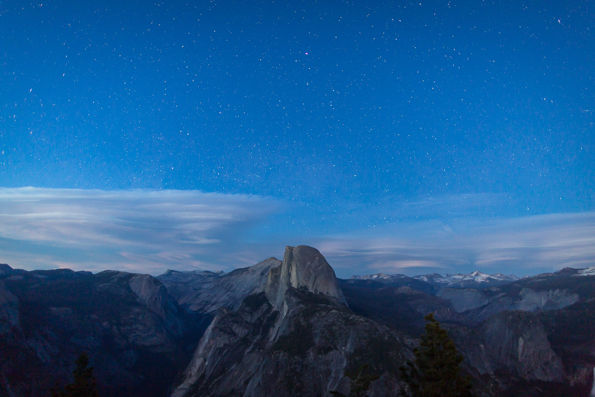
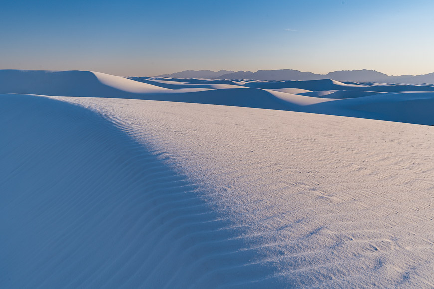
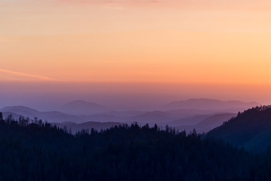
Blue Hour Drama

In the photo above, you’ll notice that the image has a cooler color temperature created from the white light of the sun during the blue hour.
Being on the far end of the color temperature scale, this is more dramatic than a white or blue light from typical daylight and you can see the higher temperature of the light as appearing very blue.
The cool light bouncing off the fresh snow makes everything appear with a blue tint.
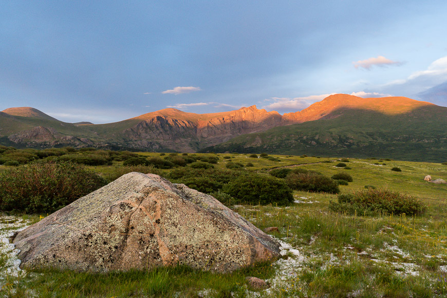
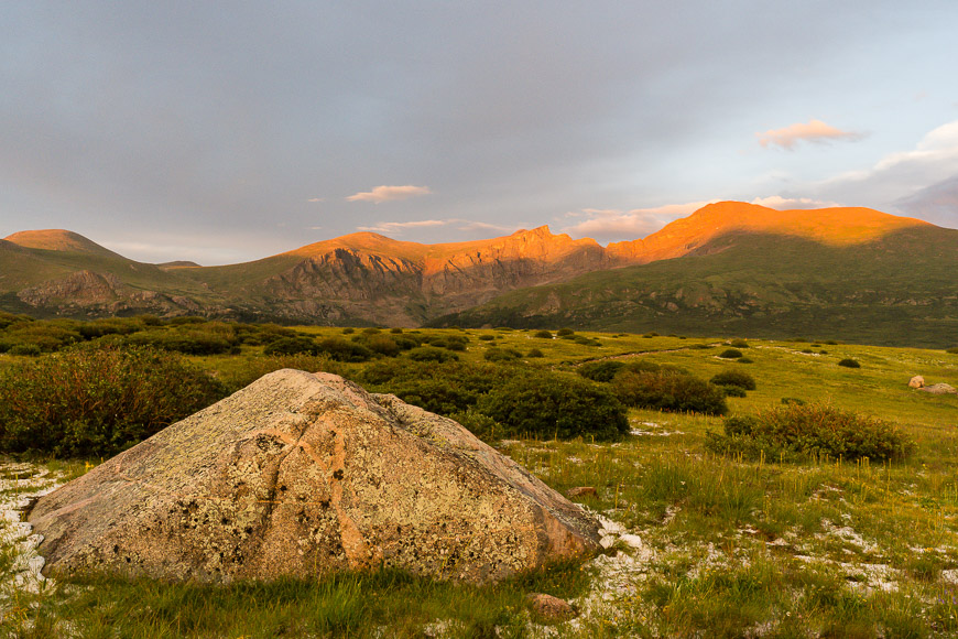
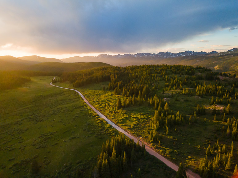
Warm Golden Light Romance
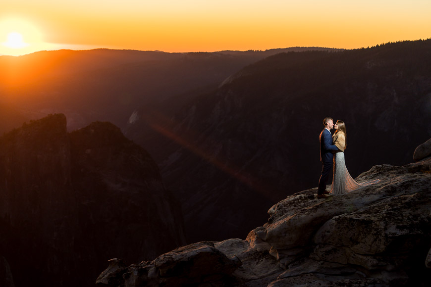
In the image above, the color of the light is clearly of a warmer color temperature.
The backlight source, being the sun, is dispersed and refracted at the lower angle that occurs during sunset.
The blue light of the sun is scattered through the atmosphere causing the remaining light to appear more golden.
A second light source just outside the frame has been modified with an orange gel (transparent plastic modifier) that makes the flash appear similar in color to the sunset.
Gels are sold in various colors, but I find the Color Temperature Orange (CTO) or 1/2 CTO to be the most useful.
Notice how the warmer tones cause the image to feel warm, welcoming, and romantic.
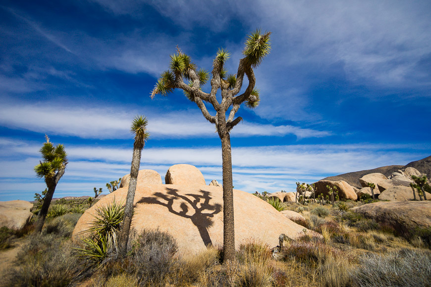
Warm and Cool Contrast
This image is an example of the use of both warm and cool light.
Notice how the contrast of light is impactful on your experience of the image.
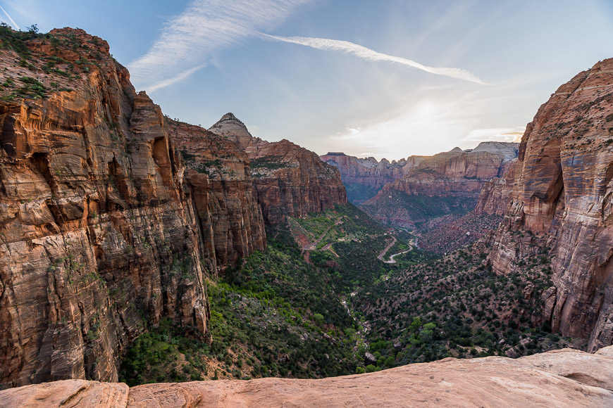
Neutral Color Temperature
And finally, this image has a more neutral color temperature of daylight.
Natural daylight provides a neutral and balanced appearance to outdoor scenes and you can see how colors appear accurate and true to life.
Vibrant, accurate colors make for timeless images, so even though I love the drama of warm or cool images, sometimes daylight is the simplest and best answer.
How Color Temperature Affects Image Balance
The following images were edited to show how unnatural an image can look when the white balance isn’t correct.
Too cool, and it looks like it was taken at night or with ultra-blue sunglasses on.
Too warm, and it looks like the apocalypse. The middle image was adjusted to have a more natural-looking white balance that matched how I saw the scene.

As you can see in the examples above, color temperature is important for making an image look balanced.
Even if you are varying color temperatures to create a contrast or using extreme color temperatures, you’ll want to use them in complementary or contrasting ways that enhance interest without looking unbalanced.
The mood and atmosphere of the image should be cohesive between what the image is communicating and what the color balance is showing.
If your subject and the background don’t look balanced, for example, it can make the subject look out of place.
That’s why flash photography can look so jarring and like the person was photoshopped onto the background. It’s because the color temperature isn’t balanced.
That’s why it’s important to balance color temperature unless you’re intentionally highlighting a warm subject on a cool background.
With some of the easy masking tools available in editing software, these challenges can be fixed, but it takes extra work. I recommend getting it right in camera!
How to Choose the Correct White Balance
In our guide to white balance, you can dive deeper into how your camera uses white balance.
This is essential in learning how to choose the correct white balance and eventually influence the color temperature.
Often, you’ll have your camera set to auto white balance, which means the camera will look at a scene and make automatic adjustments to balance its color temperature.
In addition to auto white balance, cameras have white balance options such as daylight, cloudy, incandescent, fluorescent, and flash.
My main advice is to learn about the camera you are using and how accurate the auto white balance is.
Some examples of when the auto white balance will struggle are when there’s no white surface to judge off of or if there are mixed lighting sources.
Most cameras will have other options for white balance settings that you can select if you need to be more accurate.
However, you will then have to adjust the white balance setting as your scene changes, which can be cumbersome, especially if you’re moving quickly.
If you need to be more accurate, you can use tools such as balance cards to set a precise custom balance or gels to change the color of your flashes to match ambient light.
Shooting in RAW helps here because even if your camera doesn’t nail the white balance, you have a lot of leeway to edit it in post.
With the advancements in editing software, you can even edit certain areas of a photo, making the importance of balancing the light less important.
Additionally, AI post-production tools have become quite good at adjusting white balance to be accurate. Getting color-balanced edits is easier than ever!
Using Color Temperature to Create a Mood
Color temperature is a powerful tool for creating mood and evoking emotions.
In this section, we’ll talk about how different color temperatures can be used creatively.
My favorite way to experiment is to start looking around for different types of light.
Try going out early in the morning, at sunset, or on a cloudy day. Try exploring cities at night when you will see all sorts of unique light (neon or LED signs can be especially interesting).
Warm vs Cool Colors
When you think of warm versus cool colors by this point in the article, you likely already have an idea of the type of mood color can create.
You picture the warmth of the fire or the cool and calculated classroom.
Warm colors are cozy, inviting, romantic, or nostalgic reminders of sunsets, candelights, and romance.
In contrast, cool colors are sterile, isolated, detached, peaceful, calm, serene, or stark.
You can combine warm and cool colors to create contrast and tension, showing cool shadows and warm sunlight.
To dive deeper into colors, check out these articles on color theory for photographers and how to use color saturation.
How to Adjust Color Temperature
Below, I’ll share my two favorite ways to adjust color temperature in your photography.
The good news is that they aren’t that complicated!
Since I generally leave my camera on auto white balance as I’m constantly moving from location to location, I don’t bother with adjusting color temperature in-camera.
With the power of editing software, I no longer use gels on my flashes to balance color temperature because I can easily fix things in post.
Therefore my two favorite ways to adjust color temperature are in post-processing and by choosing the time and location of my shoots.
Adjusting Color Temperature in Post-Processing
Adjusting color temperature in post-processing is a technique to fine-tune the overall look of your images.
Getting it right is important to making your images look your best. If you’re not as experienced, this is a great place to try out some AI editing tools.
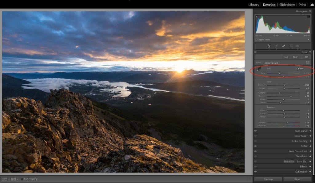
In the basic panel on the right side of the Develop module in Lightroom, you’ll find the temperature slider.
Moving the slider to the left adds cooler blue tones, while moving it to the right adds warmer yellow tones.
If you need to balance color temperature, you can automatically select the people or the background and adjust their color temperature.
And you can even adjust the color temperature on gradients.
One important note is that the color balance is a relative number. Just because your image was shot on a cloudy day doesn’t mean the cloudy setting is going to look right.
The software doesn’t know what type of light the image was captured in, so the software adjustment number is relative.
Basically, this just means you have to adjust the slider until your image looks right; don’t pay as much attention to the number.
Another important consideration when tuning your white balance is monitor calibration and the light you’re viewing the images in.
I always recommend calibrating your monitor and editing in a neutrally lit environment.
Here’s a guide to how to calibrate your monitor correctly.
Adjusting Color Temperature by Choosing Your Setting

Since digital cameras and editing software are so good that I don’t find myself worrying about white balance very often, when I think of adjusting color temperature, I think about planning my photoshoot properly.
If I want warm golden light, then I want to shoot during golden hour, in a candlelit room, or near a fireplace.
Conversely, if I want cool light, I can seek shade, window light, or even a blue hour time of day.
You can try experimenting with the preset temperatures on your camera or in your editing software to compare how different scenes will look.
FAQs On Color Temperature
What color temperature is best for photography?
The best color temperature for photography depends on the subject, the desired mood for the photograph, and the vision of the photographer.
Daylight is suitable for a wide range of subjects, while golden hour is well suited if you want a romantic feel. Blue hour creates dramatic images with a blue cast.
Why is color temperature important in photography?
Color temperature is important in photography for both accurate color reproduction and creating a desired mood and atmosphere.
You’ll want to use color temperature in your creative expression to enhance storytelling or convey emotions while also maintaining consistency across images.
How do you measure color temperature in photography?
In photography, color temperature is measured using the Kelvin temperature scale (K).
Most digital cameras allow photographers to adjust the white balance settings to compensate for different lighting conditions.
You can also use a gray card, white balance card, or color temperature meter to get accurate color reproduction.
In post-processing, photographers can further refine the color temperature in their editing software using a calibrated monitor to accurately asses color temperature.
What color temperature is best for outdoor photography?
Outdoor photographers need to know how to use a variety of color temperatures in their photography in order to show the variety of light seen in nature.
The light temperature of natural daylight is 5500-6500 K, which will provide a neutral and balanced appearance.
However, outdoor photographers will also shoot during golden hour when the color temperature is 3000-4000 K.
Is 3000K warm or cool?
3000 K would be considered a warm color temperature and would produce a reddish or yellowish tone.
At 3000 K, the light will have a warm, cozy feel like that of the glow from candlelight.
What are the 3 color temperatures?
Warm or low color temperatures include temperatures below 4000 Kelvin and have a reddish or yellowish tone like that seen during sunrise or sunset.
Neutral or medium color temperatures range from 4000K to 5500 Kelvin and produce colors that are neither warm nor cool, such as daylight.
Cool or high color temperatures include temperatures above 5500 Kelvin and have a bluish or whitish tone such as fluorescent lighting.
What is the color temperature of daylight?
Daylight, which has a color temperature of around 5500K, is often considered a neutral reference point for color temperature in photography.
Credit : Source Post


